outsider art fair
outsider art fair
outsider art fair

project description
project description
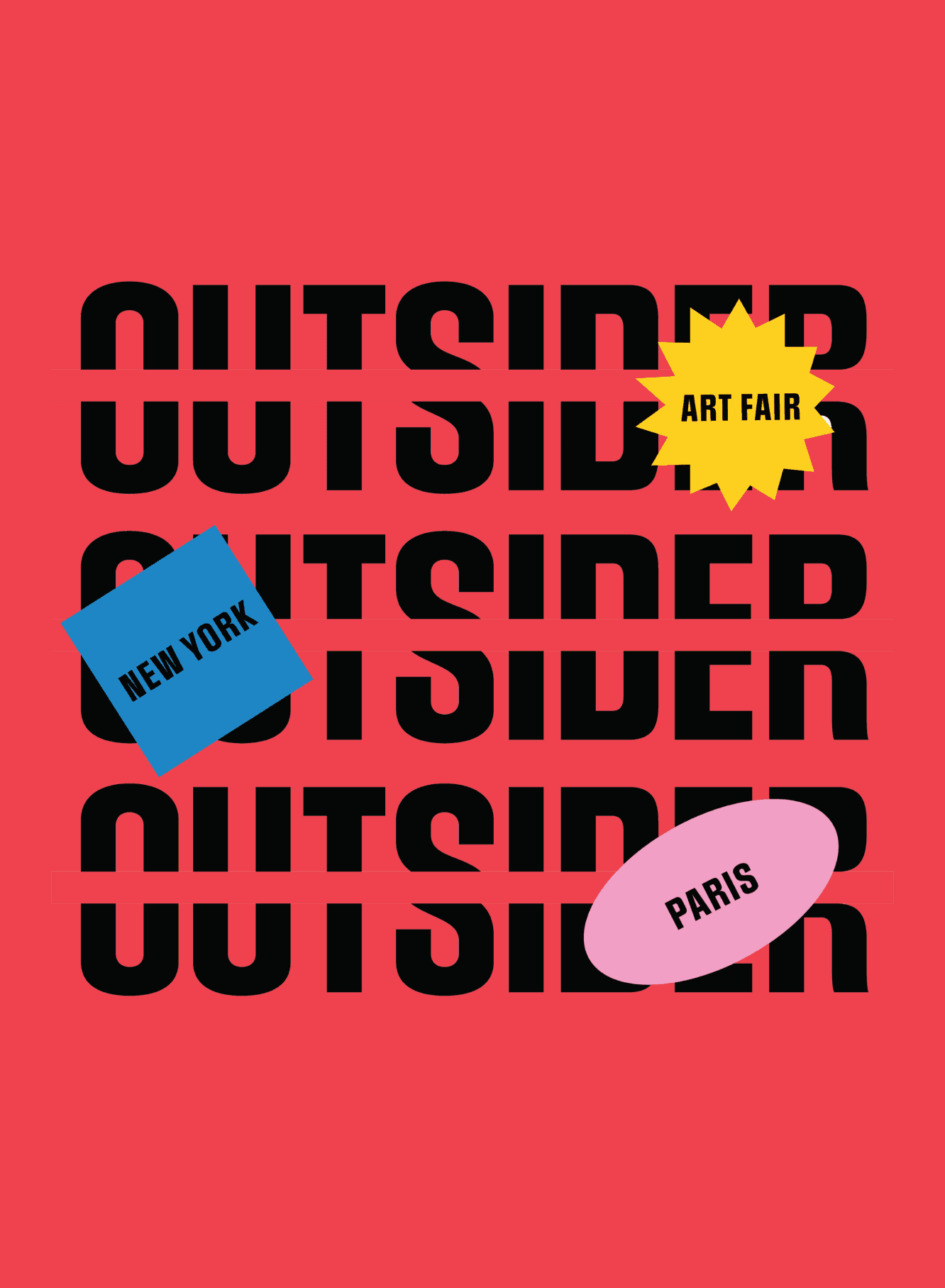
The Outsider Art Fair is an international event held in New York and Paris showcasing the work of self-taught artists whose creative practice exists outside the traditional art world. Their work is raw, unedited, and unconventional — shaped by personal vision rather than formal training or cultural expectation.
The goal was to design a visual identity that doesn't just represent the fair, but embodies the same spirit as the artists it celebrates.
The Outsider Art Fair is an international event held in New York and Paris showcasing the work of self-taught artists whose creative practice exists outside the traditional art world. Their work is raw, unedited, and unconventional — shaped by personal vision rather than formal training or cultural expectation.
The goal was to design a visual identity that doesn't just represent the fair, but embodies the same spirit as the artists it celebrates.
roles & responsibilities
roles & responsibilities
Visual Designer
Visual Design, Brand Identity, Print Design
Visual Designer
Visual Design, Brand Identity, Print Design
context
context
Academic project
Academic project
design concept
design concept
design concept
The visual identity is bold, expressive, and intentionally disruptive, reflecting the raw, unconventional spirit of outsider artists. Outsider art exists outside the traditional art world, made by self-taught artists who create without formal training or cultural validation. The identity takes that definition literally: every design decision breaks from convention the same way the artists do.

the look & feel
the look & feel
Typography
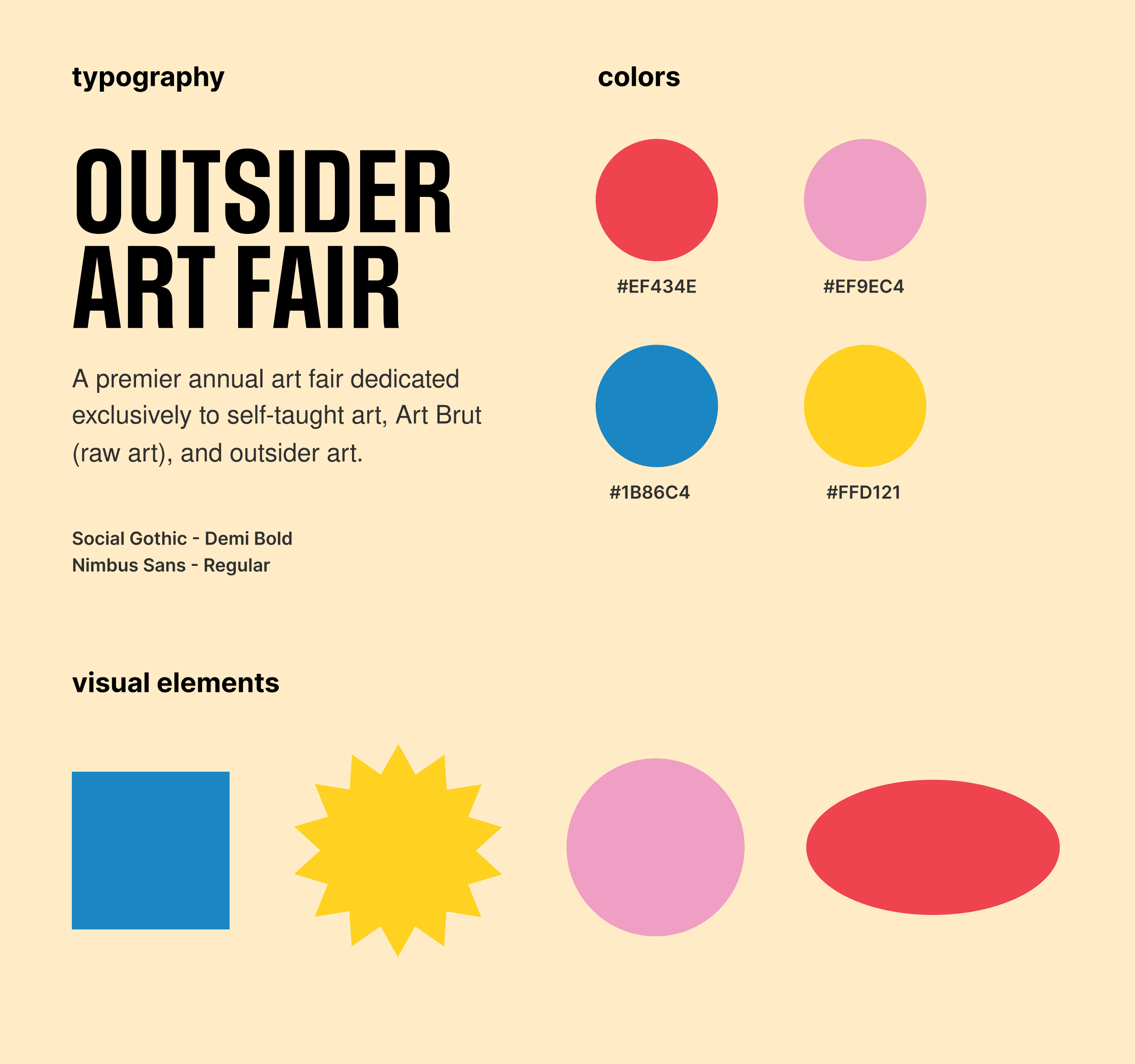
Deliberate breaks in letterforms reference the outsider artists' tendency to fracture and reimagine convention: the type itself behaves like the art.
Color & Shape
Vibrant, saturated colors and playful geometric shapes mirror the expressive energy found in outsider artworks.
Typography
Deliberate breaks in letterforms reference the outsider artists' tendency to fracture and reimagine convention: the type itself behaves like the art.
Color & Shape
Vibrant, saturated colors and playful geometric shapes mirror the expressive energy found in outsider artworks.


design system & applications
design system & applications
design system & applications
The identity was built as a flexible system, designed to stretch across contexts without losing its character.
The identity was built as a flexible system, designed to stretch across contexts without losing its character.

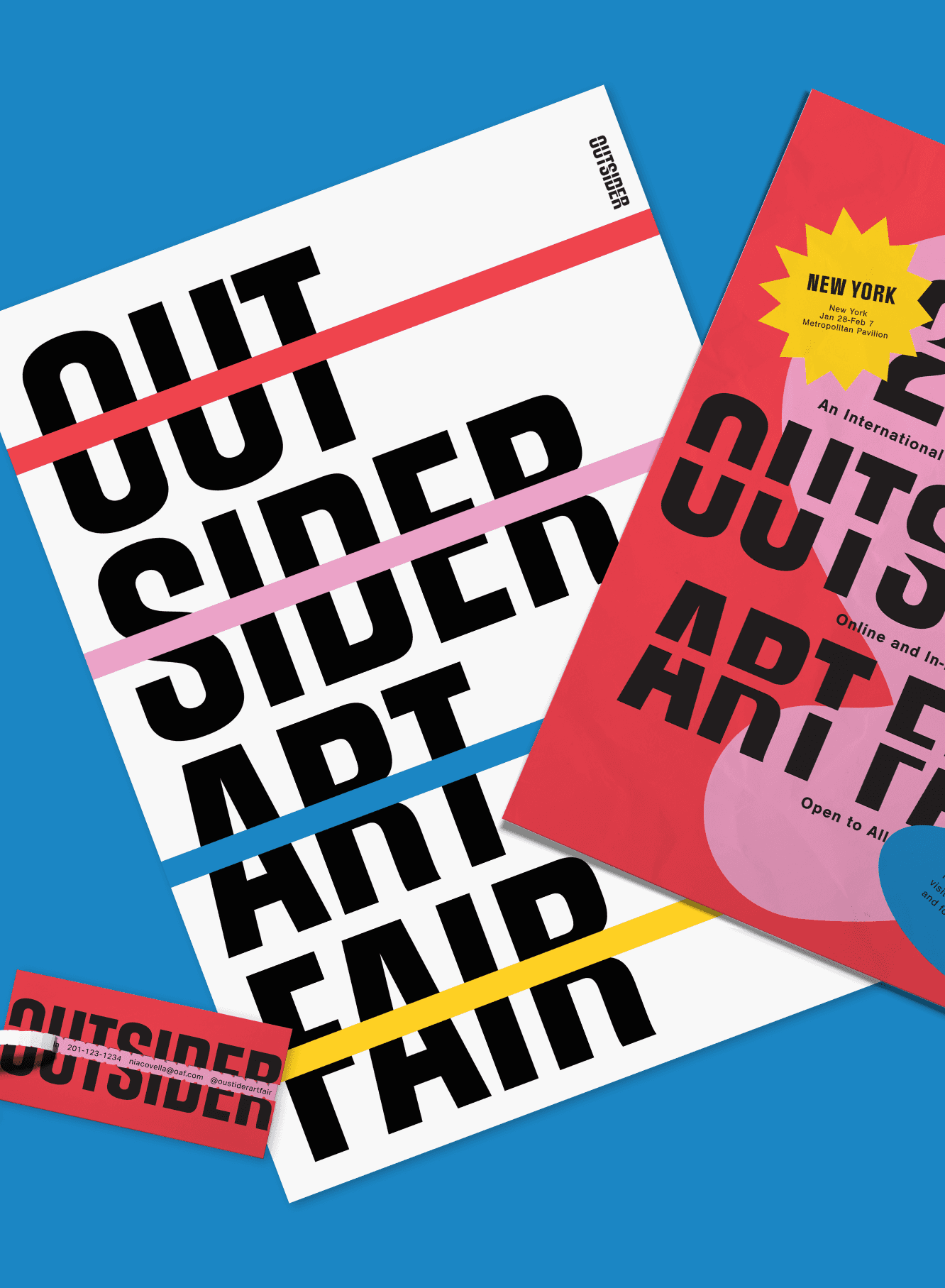
Print Posters and collateral carry the full weight of the typographic and color system. Large type, fragmented forms, and bold color blocking make even static pieces feel kinetic.
Print Posters and collateral carry the full weight of the typographic and color system. Large type, fragmented forms, and bold color blocking make even static pieces feel kinetic.

Print Posters
Print Posters
Print Posters


Advertisements
Advertisements
Advertisements

Stationery
Stationery
Stationery


Brochure
Brochure
Brochure


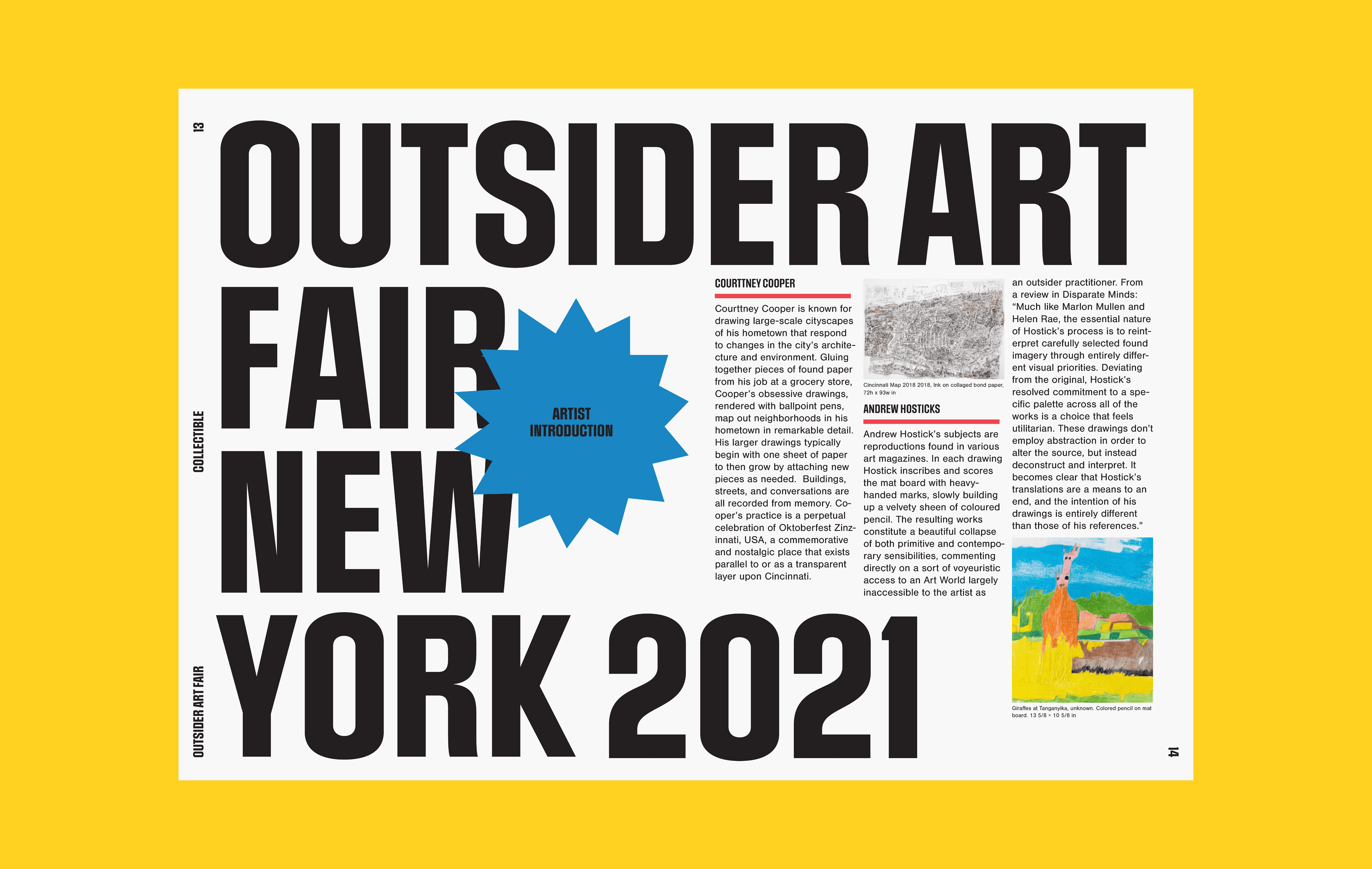


Newspaper
Newspaper
Newspaper
merchandise
merchandise
The identity extends to apparel and tote bags — bold shapes and color that you can wear.
The identity extends to apparel and tote bags — bold shapes and color that you can wear.


interior design
interior design
Wall graphics use the same visual vocabulary, so walking into the fair feels continuous with the brand.
Wall graphics use the same visual vocabulary, so walking into the fair feels continuous with the brand.


reflection
reflection
This was my first large-scale brand identity project, and it taught me the importance of designing a flexible visual system that can adapt across multiple applications. Exploring new ways to apply the same elements across different touchpoints was challenging but rewarding.
This was my first large-scale brand identity project, and it taught me the importance of designing a flexible visual system that can adapt across multiple applications. Exploring new ways to apply the same elements across different touchpoints was challenging but rewarding.